No matter whether corporate website, online store or social network, a brand has to assert itself on a variety of channels and leave a good impact everywhere. Corporate design manuals and style guides are designed to help achieve this. And more and more companies are turning to design systems. What are they good for and how do they work?
Our modern technologies have led to a paradigm shift in the way we communicate. The information unit “page”, which has been generally accepted for a long time, is increasingly disappearing. It is replaced by multimedia user interfaces in which we navigate by means of various interaction processes. As a result, the requirements for the presentation of content are also changing. In addition to readability and aesthetics, usability and responsiveness play a decisive role.
This turbulent change is currently forcing communication designers to re-evaluate their traditional design and development methods and rethink how they want to communicate with their clients and what the results of their work should ultimately be.
Alongside the already established «content management systems», «design management systems» or short: «design systems» are now increasingly being used to help meet the growing communicative demands that users place on digital services or products.
What is their advantage?
I don’t think I need to say much about the positive impact that a consistent and positively perceived brand experience has on the business value of a company.
Every marketing team and every UX professional is aware that a coherent and consistent corporate design has an enormously positive influence on the customer journey. Next to product and service quality, it is one of the most trust-building factors in terms of brand and value proposition. It determines the reputation of a company in the long term.
All the more surprising that many companies do very little to ensure the quality of their design elements and standards. Many methods and tools in this regard are often still analog, make use of digital bridging technologies (such as PDFs) or are characterized by significant media breaks.
Often companies are not always to blame for this. If you take a look at the development workflows of many digital agencies, you can see that this is a very traditional and no longer up-to-date approach.
Most front ends of large websites are still created «page template based». This usually means designing key templates, such as the start page, overview and detail pages or other necessary pages and content elements – first via wireframes and finally via mockups.
If the budget allows it, a style guide or UI documentation will be created in addition to a developer handoff for quality assurance purposes. In most cases, however, these are only valid until the next relaunch of the website.

This procedure is neither efficient nor sustainable. It would be much better to first develop a modular design system that provides designers and developers with modular components that they can then use to create an unlimited number of page templates – quasi via «drag & drop». Only then would the UI designers use these components to create the page templates necessary for the user journeys.
This not only reduces the effort in the page creation process and thus the costs of the technical implementation, but also leads to an integral harmony and consistency of the resulting pages – finally over all user interfaces created with it.

A design system differs from a styleguide in that it schematizes and patterns a design, allowing a systematic and modular approach to the creative conception of artifacts. Therefore the development of a design system should logically be at the beginning of the conceptual process rather than at the end.
A design system helps to bring continuity into the design process – also in the long run. Nothing everything has to be thrown overboard with every relaunch. An evolution of the design in line with the changing conditions makes sense. Complete breaks often unsettle users and consumers more than they benefit.
Thus, a design system is the ideal tool when designers, developers and stakeholders communicate with each other or when different teams or agencies work together on a complex project over a long period of time.
A design system should be designed for sustainable use and therefore be scalable. It should grow with changing requirements and not lose its validity with the next relaunch. This continuity strengthens brand acceptance and increases consumer confidence.
Often our clients neither know the right approach nor its advantages. Here, agencies are actually obliged to inform their clients about the various possibilities in the conception of complex digital solutions and their effects on the technical implementation and quality assurance of their corporate design.
This was also the case with one of my commissions. In 2019 I participated in a pitch for the design of a basic layout for the relaunch of about 50 websites. My agency won the pitch. But not by offering our client the conception of the desired basic layout, but rather by suggesting the development of an «atomic design system» from which the 50 individual websites could be generated. Our client quickly realized what additional values this approach would generate for him, namely…
- the development of a holistic design system guarantees a consistent brand experience across all touchpoints.
- this will allow digital products to be developed not only faster but also more cost-effectively in the future.
- design systems eliminate sources of error and redundancies. This not only increases the quality of the touchpoints, but also reduces the quality assurance effort and frees up resources for product improvement.
Nevertheless, we faced further challenges:
- How do we make the design system accessible to all stakeholders?
- How do we ensure that each team uses the same technologies, elements and patterns?
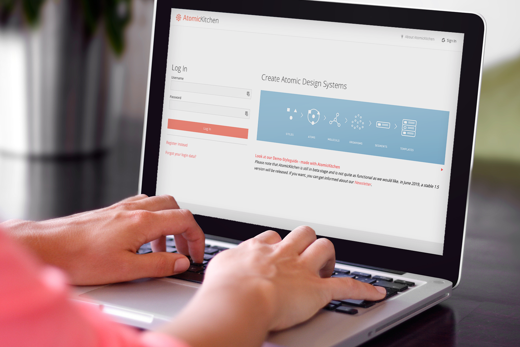
For this purpose, I developed a tool called https://atomic-kitchen.com, with which one can not only create a modular design system, but also make it available online via a frontend – and this even dual: On the one hand as a responsive visual «Pattern Library» which presents the developed design components and the templates built from them to all stakeholders pixel-precise and responsive for review, and on the other hand as a «Code Library», which provides the developers with the corresponding HTML/CSS code via «Copy & Paste».
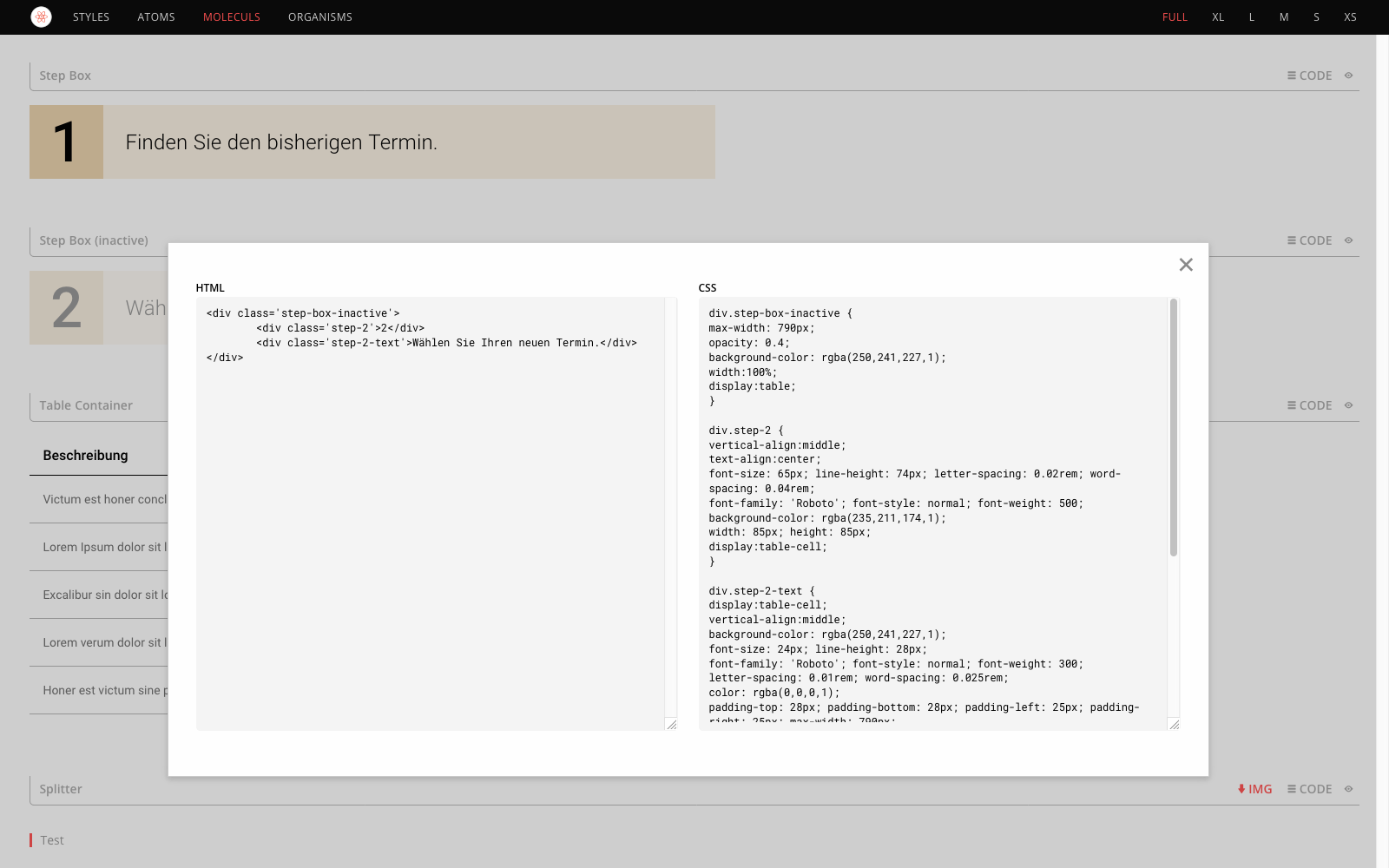

If some details of the smallest design units (the atoms) change due to new requirements, this adjustment is automatically and globally applied to all components of the pattern library. The snippets in the code library also change automatically.
How to create a design system?
The best thing to do is to imagine a big box with hundreds of Lego bricks, whose building blocks consist of maybe 20 different colors and shapes and can be assembled to almost any imaginable structure. Maybe you even have pictures of the finished models that can be built with these bricks. Whoever has tried it knows that it is not that easy to build these models without step-by-step instructions.
From this illustration it can be concluded that there are two phases: the creation of a design system (the building process) and the application of it (the assembling process).
If necessary Lego bricks are missing or do not have the appropriate properties, the users cannot build the models they are supposed to. Therefore the Lego brick designers have to think about the necessary properties of the bricks. So which bricks are basically needed and what must these bricks look like?

In the same way, an «Atomic Designer» schematizes and modularizes design ideas. He works from the general to the specific, building small components into larger modules. This is why this construction principle is called deductive.
The principle of reusable components contributes to a harmonious and consistent appearance.
During the development of a design system, it is often necessary to adapt the original designs several times and to constantly evaluate and correct them, so that ultimately modules are created that build on each other and can meet the design wishes of the UI factory.
This principle of coordinated and reusable components leads to a considerable reduction of effort in the subsequent technical implementation, since the digital applications to be designed are themselves modular in structure. If the design system is linked to a code library, the time-consuming and error-prone translation of design into code is also eliminated. This reduces misinterpretations and misunderstandings.
Qualitative requirements for a design system
The creation of a design system is not a trivial matter. The demands placed on it are manifold. In order to use it efficiently for the intended design cases, it should be designed for all possible applications. This requires a certain amount of coordinated components as well as an intensive examination of the use cases and the user journeys of the applications for which it is to be used.
The components for a website, for example, must behave responsibly. For example, a three-column teaser box on a mobile phone is converted into three rows. The seven elements of a header navigation change from a certain breakpoint to a hamburger menu icon. This creates a large number of responsive states for each component.
Therefore, the rapidly growing number of elements and states should be presented clearly and self-explanatory. A difficult to use or confusing design system is not a big help. In the front end of Atomic Kitchen, we have therefore integrated a search function with autosuggest functionality, so that developers and integrators can quickly find the right components.
And here it becomes clear that only a design system based on HTML/CSS, which shows how the elements behave when changing the browser window size, during a hover or a mouse click, is clear and self-explanatory. Only this can provide a real «Look & Feel».

A code-based design system is therefore not only a wise choice from a technical and economic point of view, but is also perfectly suited to evaluate the user experience of its components by enabling a real look & feel and native responsiveness.
Individual development of design systems
As an experienced partner in the development of design systems, I can also develop an individual design system for your company that precisely meets your requirements. Talk to me. I will be happy to show you how you can profitably integrate a design system into your workflow, be it for a planned website relaunch or to manage your corporate design.