


Content structure and navigation must support each other.
Both, a structure that is difficult to understand – often constructed from the sender’s point of view – and a cumbersome or non-expected navigation prevent users from finding what they are looking for.
A few words about the underlying information architecture
The information architecture forms the basis for the findability of information, functions, services and products. It is the structural organization of the contents.
For structuring, the actual content is needed, but also additional data, such as how the content is related to each other, i.e. its relations. But also, correct category or class designations as well as tags*1 are part of it, which play an important role for example when searching or filtering content. Thus, in addition to knowledge of the taxonomic context, a deep understanding of the semantics of the content is required.
The classification of content into groups and sub-groups and the links between them creates a conceptual scaffold that enables a systematic acquisition of information and forms the basis of the user’s intended appropriation process.
Due to the multitude of possible relations between the content and their organizational units (e.g. pages), a website can often no longer be adequately represented in a classical tree diagram; in principle, a multidimensional array is required.
In order to depict an information architecture on a website or an app and also to navigate within it, a navigation system or even several, for example global and additional contextual navigation systems are used.
Often such a navigation system does not display all contents or relations, only a part which is relevant for the planned use of the website, as otherwise the user would be overwhelmed while navigating.
Below you will find the requirements we demand for a user navigation for reasons of ergonomics.
Requirements for user navigation
Clarity
A user of a website should be able to see at a glance where he is in the menu tree (or in the page structure of the website), i.e. which parent, sibling and child elements exist for his page position. Too many parent and child elements (a high number of hierarchies) make this difficult – too many sibling elements (too many elements on the same level) as well.
We can easily perceive 7 elements ± 2 (The Magical Number Seven*2) within a group (= same hierarchy level), compare them and store them in the short-term-memory. Within hierarchical systems, we still keep the overview with a maximum of two super- and subordinate levels (thus resulting in a maximum of 5 hierarchies). But we feel really comfortable with only one superior and subordinate level, which results in a maximum of 3 hierarchies.
A perfect information architecture could thus comprise a maximum of 384 pages (6 + 6×7 + 6x7x8). But since many content publishers have to (or at least want to) display more pages, a compromise between the two requirements (as flat a hierarchy as possible and only 7 pages per level if possible) should be strived for.
For example, to display 2000 pages in a hierarchical arrangement, 4 hierarchical levels with an average of 7 pages are better than 2 hierarchical levels with an average of 45 pages each and also better than 6 hierarchical levels with an average of 3 to 4 pages. (All three examples result in about 2000 pages).
In order to ensure a user-friendly navigation system, the option of reducing the number of pages by merging content and/or splitting the website into separate instances should be considered if the number of pages is high. For example, you could offer separate websites for individual organizational units or relevant topics.
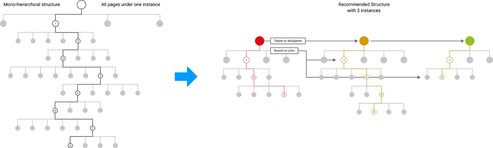
The really very large website of the Swiss Federal Railways (https://www.sbb.ch/) is a good example of this compromise. It gets by with a total of 6 hierarchy levels (1st level: 5 elements, 2nd level: 3 to 5 elements, 3rd level: 3 to 9 elements).

Using the mega-dropdown, a user on a desktop device can get directly to the third level of the hierarchy with just one click. From there, he can iteratively reach the deepest pages of the information architecture via teaser boxes.
The basis for this user-friendly experience was a comprehensive organization, content and structure concept, which enables exactly this user navigation by splitting the content into different websites, reducing it to the most essential and bundling related information in «content cluster».
Conformity to expectations and learnability
The user should be able to quickly find his way around the navigation system by an appropriate, familiar and clear arrangement of the navigation elements. Processes or functions that are unfamiliar to the user must be consistent, otherwise the ability to learn is impaired.
Comprehensibility
The user should be supported in his search and selection of information by appropriate and understandable descriptions. This can also be done by additional explanatory information (texts, images) within the navigation or by overview pages (which are called up by clicking on a menu element). Especially for navigations with many technical terms and terms unknown to the user, these additional aids increase the usability and the user experience.
Simple usability
The user should be able to reach the content he is looking for with as little time and effort as possible (shortest possible distances with the mouse or finger, as few clicks as possible, max. 3 to 4).
Intuitiveness
The navigation should, if possible, be equipped with elements that are known to the user and that clearly explain themselves. Functionally relevant click-sensitive elements should be clearly recognizable as such, otherwise they will not be used. User-centered semantics and, if pictograms or symbols are used in navigation, that they are known and understandable in the relevant context of use are essential.
Positive effect in the visibility of the page contents in search engines (SEO)
The most common search queries should also be reflected in the names of the menu elements of the navigation system. For each menu element, there should ideally be a link to a page with matching, non-redundant content.
Navigation concepts
In principle, there are only two different navigation concepts, but due to possible mix-ups they lead to various combinations.
On the one hand, there are navigation systems that directly load a page, so-called «Non-Popup-Navigations» and on the other hand, there are navigation systems that open lower hierarchical levels with a click until you reach the lowest level – only there you can open a page, these are called «Popup-Navigations».
Non-Popup-Navigations
If this type of navigation is used consistently, it leads to subpages with either a teaser or contextual on-page-navigation*4 in addition to the global top-level-navigation*3. This is the classic approach of Web 1.0, but due to its high level of clarity, it is experiencing a renaissance today and enjoys great popularity, especially in online stores.
It is also used when users are confronted with many unknown names, structures and contents and have to get additional information (explanations, pictures, teasers) to find their desired target. They are also well suited if users want to inform themselves holistically about a topic.
An example of this type of navigation is the desktop view of the website of the City of Zurich (https://www.stadt-zuerich.ch). The disadvantage of this type of navigation is that each user click results in a page load that is connected with loading time and navigation over more than three hierarchical levels is perceived as cumbersome and exhausting.
Especially if teasers (via so-called distribution pages) are used for this purpose, navigating on smaller viewports (mobile devices) becomes very cluttered, since you have to scroll a lot and the frequent reloading of page contents makes it a puzzle. (see for example https://www.postfinance.ch/de/privat/produkte.html or https://www.sbb.ch/de/abos-billette/kaufmoeglichkeiten/verkaufskanaele.html)
If you use this type of navigation, the breadcrumb plays a more important role for most users as an orientational aid on desktop viewports. In this case it should be especially user friendly and significant.
Because of these well-known consequences at mobile devices, which have a negative impact on user-friendliness, this navigation type is usually not used «mobile», e.g. as in the case of the city of Zurich, which uses a pop-up navigation type described below for mobile.
Popup-Navigations
The «Popup-Navigation» is the more modern, but not always necessarily better approach. Numerous front-end technologies can be used to unfold the sublevels, e.g. you can use accordions, dropdowns, flyouts, off-canvas, to name the most important ones.
When used consistently, this type of navigation means that the menu elements that open subpages do not have their own page content, which can have negative impacts on information architecture and SEO. The so-called pillar-pages*5 are missing.
Also, in the case of very deep navigation, the selection process of the target page, which the user has to perform completely in one step within the navigation, is perceived by many people as exhausting.
This approach works well for users who know exactly what they are looking for and need no explanatory or additional information within their user journey. These users can go directly to a page that is “hidden” very deep in the page hierarchy without reloading further pages – with a single access to the navigation. Therefore, these navigations are also called “Deep Level Navigations”.
On devices where a mouse over is available as an activation option in addition to the mouse click, both forms (non-popup and popup) are often mixed. A mouse over opens a sublevel in the navigation (e.g. via an accordion functionality), a click on the other hand opens a subpage. However, the problem occurs then in a responsive way – because the touch screens of our mobile devices do not have a mouse and thus no mouse over.
Therefore, all menu elements that open sublevels do not have pages that can be opened, which has a negative effect on SEO, but also leaves unanswered the question whether relevant content will be lost.
Or you can try to circumvent the problem by using down or right arrows to display a two-part functionality in the menu: a click on the name opens the page, a click on the arrow opens the sub-levels. However, user tests have shown that this functionality is hardly understood by users or simply not used.
It is currently best practice to implement an overview-page in the navigation at each level, which provides the content of the selected category (see for example https://www.postfinance.ch).
From the user’s point of view, it is important to ask whether it is really necessary to deposit content in the form of overview or entry pages for each category. Particularly in the case of very general top-level navigation elements such as «Our products» or «About us», it is possible to omit entry or overview pages without any problems. These pages do not have any relevance even in an organic search (i.e. those via search engines) and do not offer users any interesting content. See for this: https://www.postfinance.ch/de/privat/beduerfnisse.html. On this actually unnecessary page, a paragraph with a short promotional text was placed due to embarrassment.
A good compromise is to display one part of the navigation (e.g. the top-level-navigation and up to two levels below it) via a pop-up-navigation system and all levels below it via an on-page-navigation system. This is exactly what https://sbb.ch, for example, does.
The terminology of the top-level-navigation is naturally the most comprehensible of the entire navigation, it is self-explanatory such as «products» and does not play an important role within the organic search or in SEO. They rarely contain actually relevant information, but often only very general advertising texts, which play no role in the information acquisition process. This means that for the menu elements of the top-level-navigation, overview pages can be dispensed with from both the user and SEO point of view.
Menu elements in the lower hierarchies often have terms that are not so generally understandable and therefore need much more explanation. The relevance or comprehensibility of these menu elements is therefore supported by an on-page-navigation, which also provides additional information via teasers and explanatory texts.
For this reason, users in the first 2 to 3 hierarchical levels find their way around easily and usually want a popup-navigation to take them to either the target page or to an pillar-page in one step, where they can use an on-page-navigation to go deeper into subpages step by step.
Glossary
*1: Tag
A tag is a label or sticker and is used to add semantic information to a data set to describe it in more detail. These tags are subject to a fixed term system and are used for filters and navigational related content concepts.
*2: The Magical Number Seven
The «Magical Number Seven» describes the fact that a person can only hold and process 7 ± 2 units of information in his short-term memory at the same time. We find clusters consisting of up to a maximum of 7 elements manageable and pleasant – larger groups overwhelm our perception and stress us.
*3: Top-Level-Navigation
The «Top-Level-Navigation» (also called primary navigation) is usually located in the header area of a website and displays the elements of the top level of the site hierarchy – often horizontally. On some websites and almost all smaller viewports (mobile devices) it is called up via the so-called «hamburger menu icon». There in the off-canvas-menu, its elements are usually arranged vertically.
In the desktop view of a website, it usually remains visible on all pages; often even «sticky», i.e. even when scrolling down a page, it remains in the upper viewport of the browser. This underlines its importance within the user navigation of a website.
On many smaller websites (approx. 1 to 9 pages) the user navigation consists exclusively of top-level navigation. On larger websites, a “mouse over” or «click» on one of their elements will open dropdowns or accordions with subordinate menu elements.
*4: On-page-navigation
An «On-page-navigation» represents a navigation that is not located in the typically navigational area (e.g. header or footer), but in the content area. Usually it is located in a box or area below the header or in a column to the left of the content.
Usually this navigation will list its sibling pages, sometimes also its subordinate pages – which distinguishes it in both cases from the breadcrumb navigation, which only shows its “path” (i.e. only the superordinate pages).
*5: Pillar-pages
«Pillar-pages» is a term from the search engine optimization. It is used to describe entry or overview pages that give a broad overview of a topic and provide orientation for users. They form the center of a «topic cluster».
From a pillar-page, links are provided to subpages of the respective «topic cluster», which deal more specifically with detailed issues. Through these subpages, which also refer to the parent pillar-page in reverse, the pillar-page bundles the entire topic relevance and enjoys an extremely high visibility in search engines such as Google regarding this specific topic.
The selection of adequate topics for the pillar-pages is the cornerstone for the topic relevance of the whole website and is therefore very important for the visibility of the whole website at Google. Therefore, so-called «core topics» have to be defined, which should also impact the structure of the information architecture.